I’ve been getting into professional sumo these past few months!

The overall sumo wrestler ranking system and the promotion/demotion process is really interesting. Every two months there is an official tournament, and each wrestler is given a rank. The rankings for each tournament is published in a meticulously hand-brushed listing called the banzuke.

Each banzuke includes each wrestler's full ring name, hometown, and rank is also listed. The highest ranked wrestlers are at the top of the page printed with the largest characters. This is followed by wrestlers in lower divisions, with accompanying smaller characters.
The characters are part of the set of Japanese calligraphy typefaces used towards the end of 18th century of the Edo era. The typeface for the banzuke is Sumomoji (相撲文字) and it was specifically designed for sumo advertisement. According to this video, the bold strokes in sumomoji are meant to represent the physical strength and power of the sumo wrestlers.
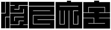
Here’s another example of a really striking Edo-era typeface—Kakuji (角字) which was used for making seals: