This WSJ article reminded me of how confusing hotel light switches are such a visceral example of mismatched mapping with controls. Watch this TikTok video and tell me…how does that make sense?
———
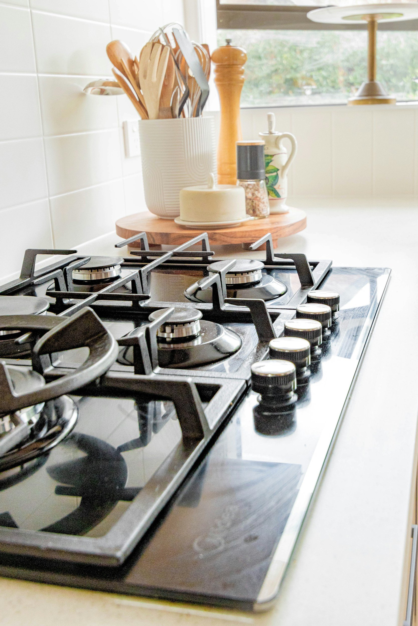
Definitely a throwback to Jakob Nielsen's 10 Heuristics for User Interface Design, namely #2: Match Between the System and the Real World. It’s nostalgic to see the stovetop as the example on that page, as it was my first “aha!” moment when I realized that it was bad design that led me to turning on the wrong stove over and over.


